Creating better examples with @exemplar/storybook
@storybook/react is a tool we can use to facilitate development of React
components by viewing them in isolation in an environment conducive to rapid
iteration and low-cost experimentation. @exemplar/storybook wraps
@storybook/react in a way that eliminates all storybook-specific boilerplate
from your code base. Without @exemplar/storybook, your examples tend to have a
lot of tangentially related boilerplate code.
For a team maintaining a large set of react components, @exemplar/storybook
achieves 3 goals:
- Copy-and-paste ready examples: a good example can be dropped into an application with little to no changes necessary.
- Clear
require/importusage: preferimport xx from 'your-module'vs. a relative path such asimport xx from '../../path/to/component'; - Hide example presentation layer: the consumers of your components don’t have to know anything about your example framework (e.g. Storybook, Docz, etc.).
How do I use it?
0. Install
Install the tool, if you haven’t already:
npm install --save-dev @exemplar/storybook
1. Setup
Setup an examples/ directory that has the following structure
examples/
  *.js        # Examples that run on all platforms
  web/*.js    # Examples that run on Web only

  .setup/        # optionally augment the build with any setup that you need
    aliases.json # Any webpack aliases
    shared.scss  # Global styles
Each of these examples (present as .js files) take the form of a regular
react component, making them extremely copy-and-paste-able directly into your
application.
import React from 'react';
import { Button } from '@your-very-own/design-system';

export default () => (
  <Button>
    Press Me!
  </Button>
);
2. Scripts
Add the following script to your package.json:
{
  "scripts": {
    "storybook": "start-storybook -p 9001 -c ./node_modules/@exemplar/storybook"
  }
}
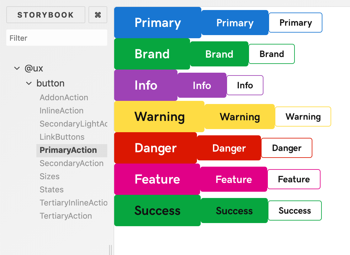
That’s it! Here is @exemplar/storybook showing all of GoDaddy’s primary action
buttons at once:
npm run storybook
What’s Next?
Right now this implementation commits to styling with .scss. Future work will
work will be done to support more than .scss out of the box.
As of right now storybook-native is still evolving. There is currently ongoing
work in the form of this PR, but it’s not quite stable enough (yet) to work
consistently on our internal react-native use cases. We’re eagerly awaiting
the results!
Cover photo by Alfons Morales on Unsplash
