React Native Community contribution
DateTimePicker component
Over the years React Native has grown substantially. In an effort to
reduce the size, complexity, and dependencies for React Native a
number of modules were selected to be transformed to community modules. Among
other modules, DatePickerIOS, DatePickerAndroid and TimePickerAndroid
were listed. Upcoming feature work for the GoDaddy mobile app
required us to integrate against these modules. What better moment to give back
to the React Native community? We migrated and merged the modules as a means to
contribute to the lean core initiative and join forces with the open
source community of React Native.
Uniform cross-platform components
The migration effort was outlined in a proposal which lists three distinct goals.
- Migrate
DatePickerIOS,DatePickerAndroidandTimePickerAndroidfrom React Native core to a separate module. - Merge
DatePickerAndroidandTimePickerAndroidto match the feature set for iOS, which supports bothdateandtimemodes. - Transform the Android APIs to React components.
By merging both Android modules and transforming the functional API to React components there are fewer platform-specific implementations. The overall goal of the new combined module is to be a cross-platform React component. It will try to converge the features of iOS and Android as much as possible.
Welcome @react-native-community/datetimepicker
Combined, the set of Android and iOS modules form a new
@react-native-community/datetimepicker component. To use
this module install it with npm or yarn and use react-native link to
bundle it in your project.
npm install --save @react-native-community/datetimepicker
react-native link @react-native-community/datetimepicker
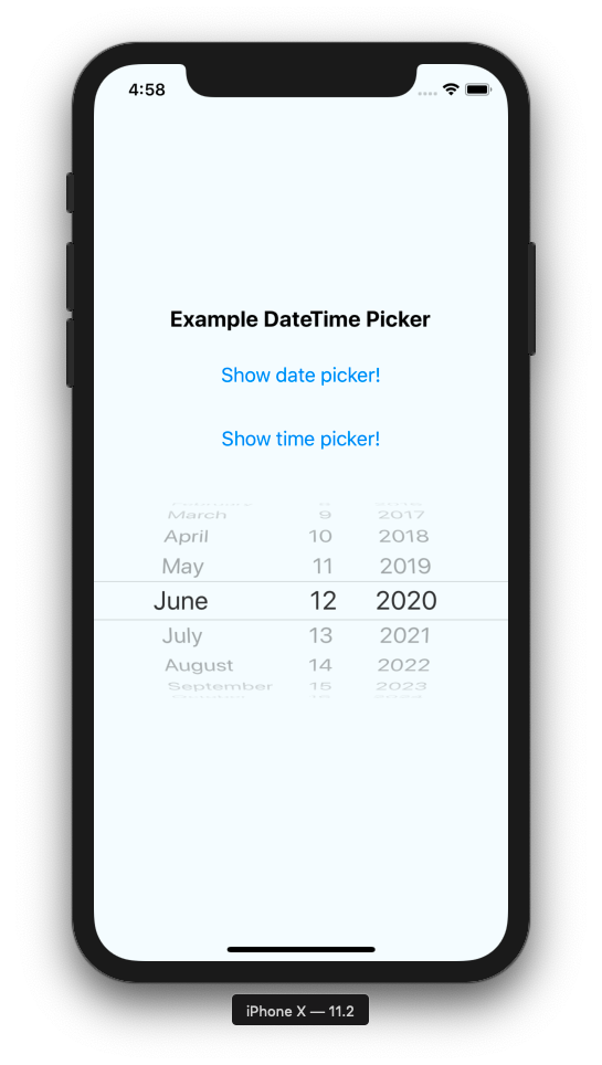
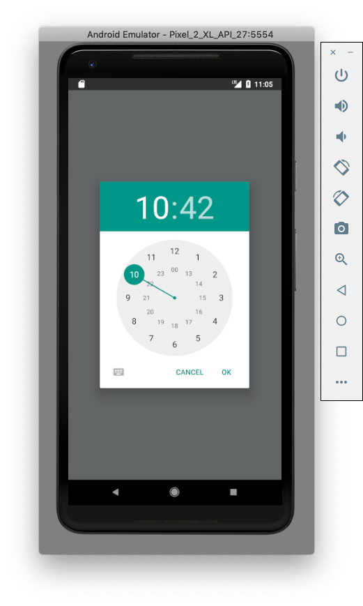
This will make the React component available for use in your project. Components will be rendered with default native UX for their respective pickers. The example below will render a date picker as Modal on Android and an inline component on iOS.
import DateTimePicker from '@react-native-community/datetimepicker';

function renderMyComponent({ date, onChange }) {
  return <DateTimePicker value={date} onChange={onChange} mode="date" />
}
Internally, the module uses React Native’s requireNativeComponent to require
the renamed native module RNDateTimePicker. A more detailed description for
installation per platform is available in the documentation of the
component.
The current component and API’s are still part of React Native. However, you can use the modules next to existing implementations. The externalized component has no references to the old code nor shares the old namespace. This makes migrating easier since you don’t have to worry about the exact React Native release that will not include the date and time pickers.
Community guidelines
We took care to follow the current community standards as closely as possible. As such the module:
- is provided with Detox integration tests.
- uses the circle.ci orb from the community to do automated testing.
- provides an example app that works.
- uses React Native’s eslint package to lint all code.
- has a podspec file available from the root folder.
In addition, transforming Mocha tests to Ekke would be a nice new
feature for the component. It would increase confidence in the DateTimePicker
features by running unit tests on an actual device and/or emulator.
Reducing API complexity
The externalization of components presented us with an opportunity to reduce
platform-specific implementations. Android had a function based
API that returns a Promise and only renders a modal once. That
implementation doesn’t fit the React render lifecycle well since external
state has to be kept to track render state. We’ll demonstrate the Android API
changes later.
For now, let’s focus on the second goal: merging the feature set of both
platforms. The merger of APIs highlighted a few discrepancies. For example, iOS
uses maximumDate and minimumDate to restrict range, whereas Android used
maxDate and minDate. Similarly, contrary to what the name suggests
DatePickerIOS is also capable of displaying as time picker by setting
mode=time or mode=datetime.
Available options
valueReplaces thedateprop. This is a better name for controlling the value of the time picker. In either case, it has to be a JavaScriptDateobject.onChangeThis methods returns both the selectedDateas well as theSyntheticEventwhenever the selected date changes. In addition,onDateChangewas deprecated for iOS. Rather than having two methods,onChangenow provides the functionality of both. For AndroidPromise.resolvewill use this callback whenever a date is selected.modeDetermines what picker should be displayed. The modesdateandtimeare available for both platforms. However,datetimeis only available for iOS. On Androidmode=timewill use the nativeTimePickermodal.maximumDatesets the maximum allowed date or time. This replaces Android’smaxDateimplementation.minimumDatesets the minimum allowed date or time. this replaces Android’sminDateimplementation.displayThis new property controls how the picker is displayed for Android which supports displaying pickers asspinnerorcalendar.
React render lifecycle
To make the Android API a better fit for the React render lifecycle it has to
act more like a renderable React Component, e.g. <DateTimePicker />. This is
achieved by storing a reference to an open instance of the modal whereas the
original implementation would dismiss the picker modal on each consecutive call
to the API. In the new implementation the open instance of the modal will be
updated with the value from provided properties.
public class RNDatePickerDialogFragment extends DialogFragment {
  private DatePickerDialog instance;

  @Nullable
  private OnDateSetListener mOnDateSetListener;
  @Nullable
  private OnDismissListener mOnDismissListener;

  @Override
  public Dialog onCreateDialog(Bundle savedInstanceState) {
    Bundle args = getArguments();
    instance = createDialog(args, getActivity(), mOnDateSetListener);
    return instance;
  }

  ...
}
Show, don’t tell
The component comes with a runnable React Native example app that uses the new component. Below are examples of the date and time picker on both platforms.


This contribution to the lean core initiative will allow the community to continue adding new features and bug fixes to the React Native DateTimePicker component without needing a new release of React Native itself.
Acknowledgements
Daniel Sanudo Vacas helped writing documentation and detox tests for the new module.